Software Used: Adobe XD, Illustrator, InDesign
In this case study, I rebranded a website that needed help. I took Airindia.com, a website for purchasing plane tickets, and performed three user experience research methods to pinpoint their issues and how to fix them. It was quite obvious that Airindia had some user interface problems and navigation issues that could be fixed. The goal was to create a more professional and trusting website that users could use with ease. Read more below to find out about the process! Click here to view Air India's original website.
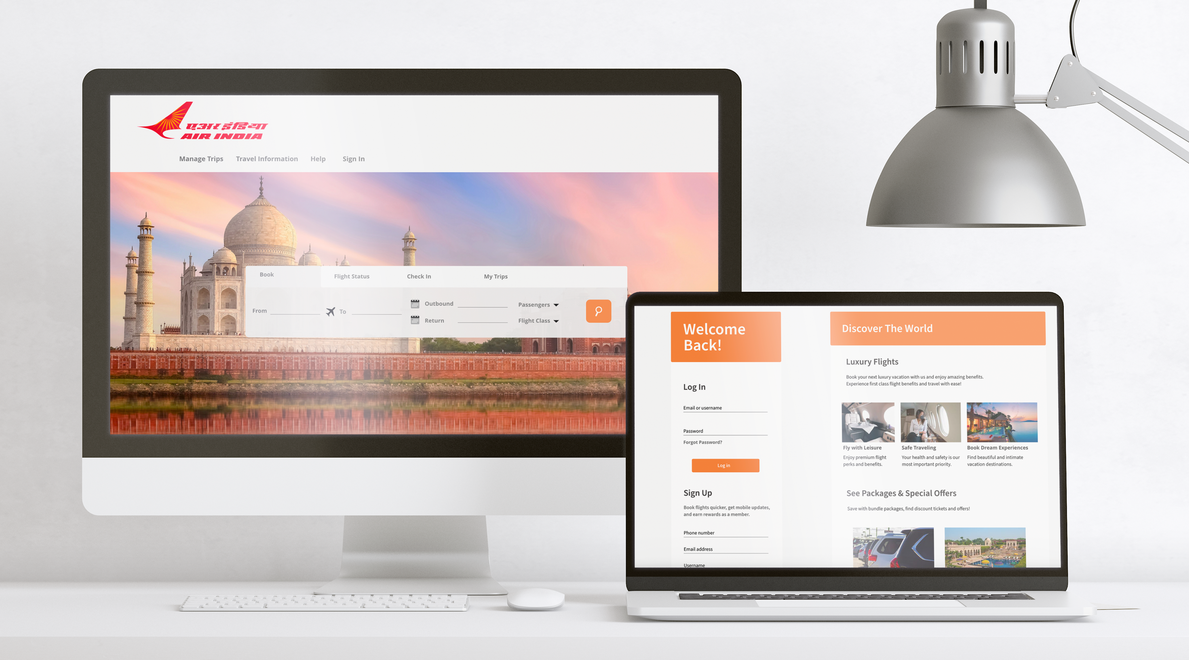

To learn about this case study in depth, view pdf here. After performing a competitive analysis, SEQ, and a five second test I found that fixing the navigation bar to contain fewer menu items and creating the input box where users plan their flights bigger accompanied by visuals and hierarchy, while also cleaning up visual clutter will create a better experience.
Prototype made on Adobe XD. View prototype here. You can also view a guided screen recording below as well.

To learn about this case study in depth, view pdf here.